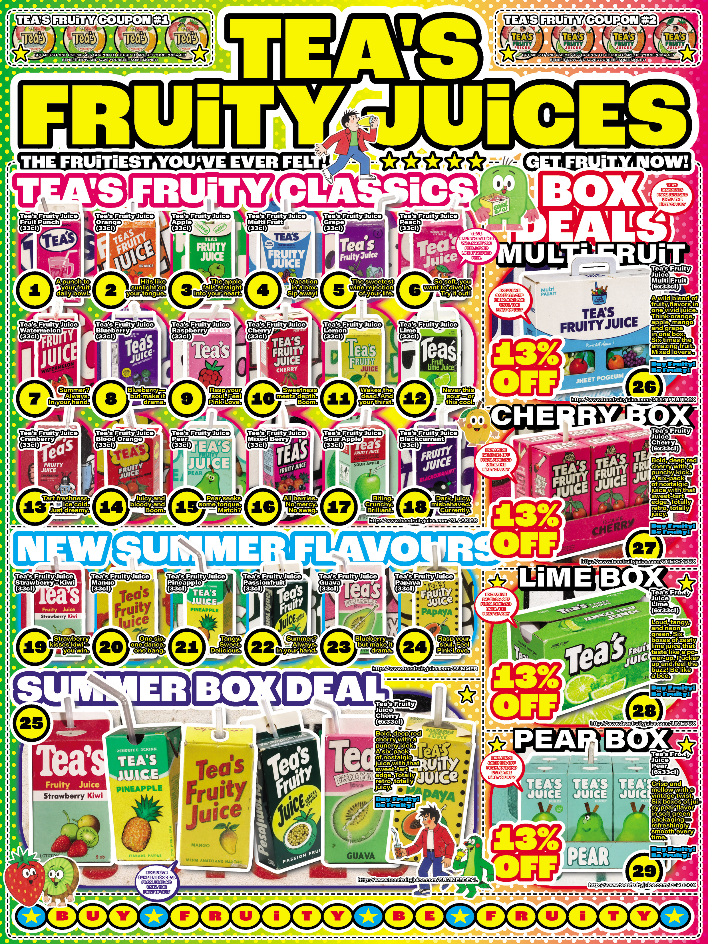
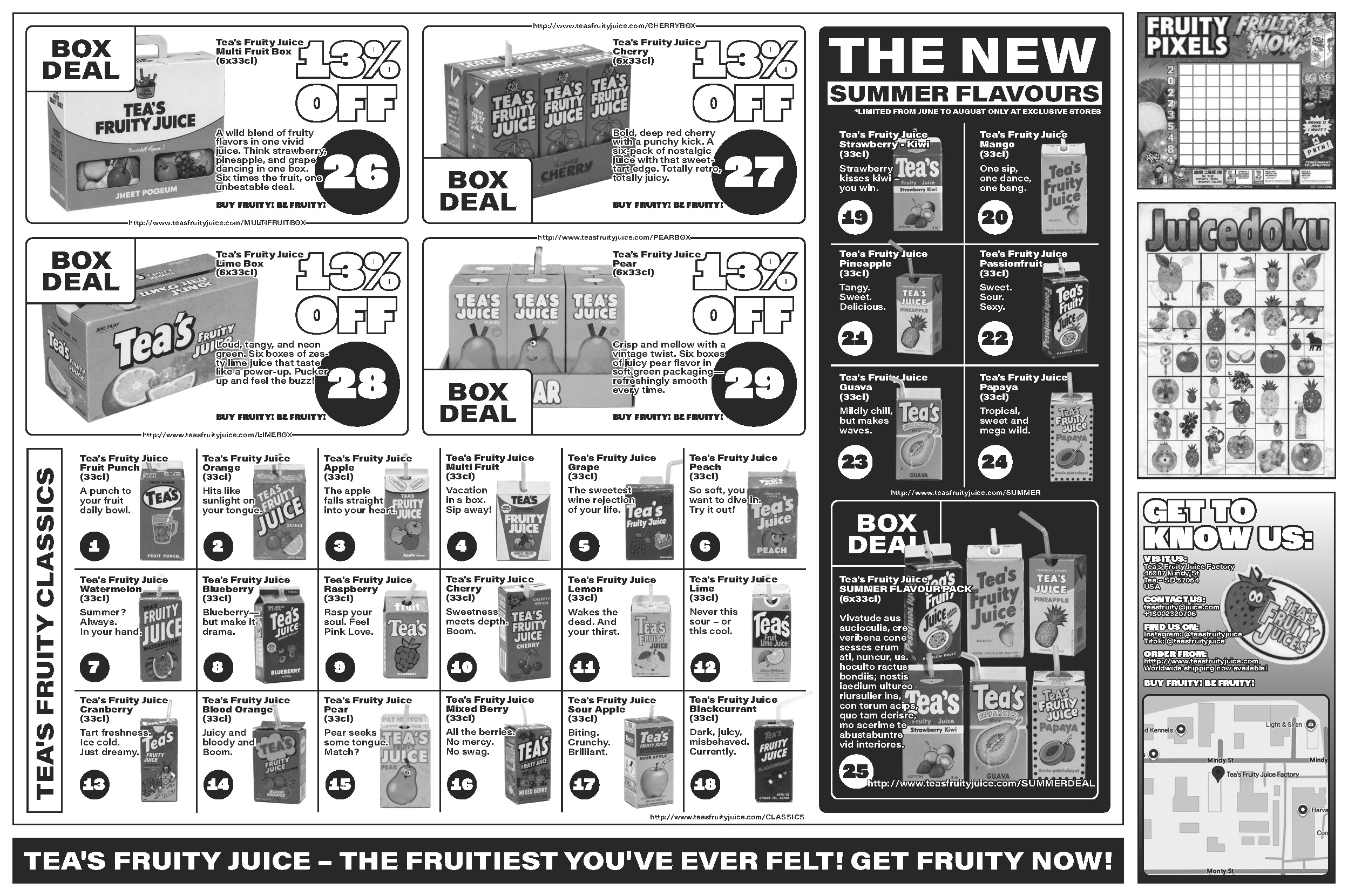
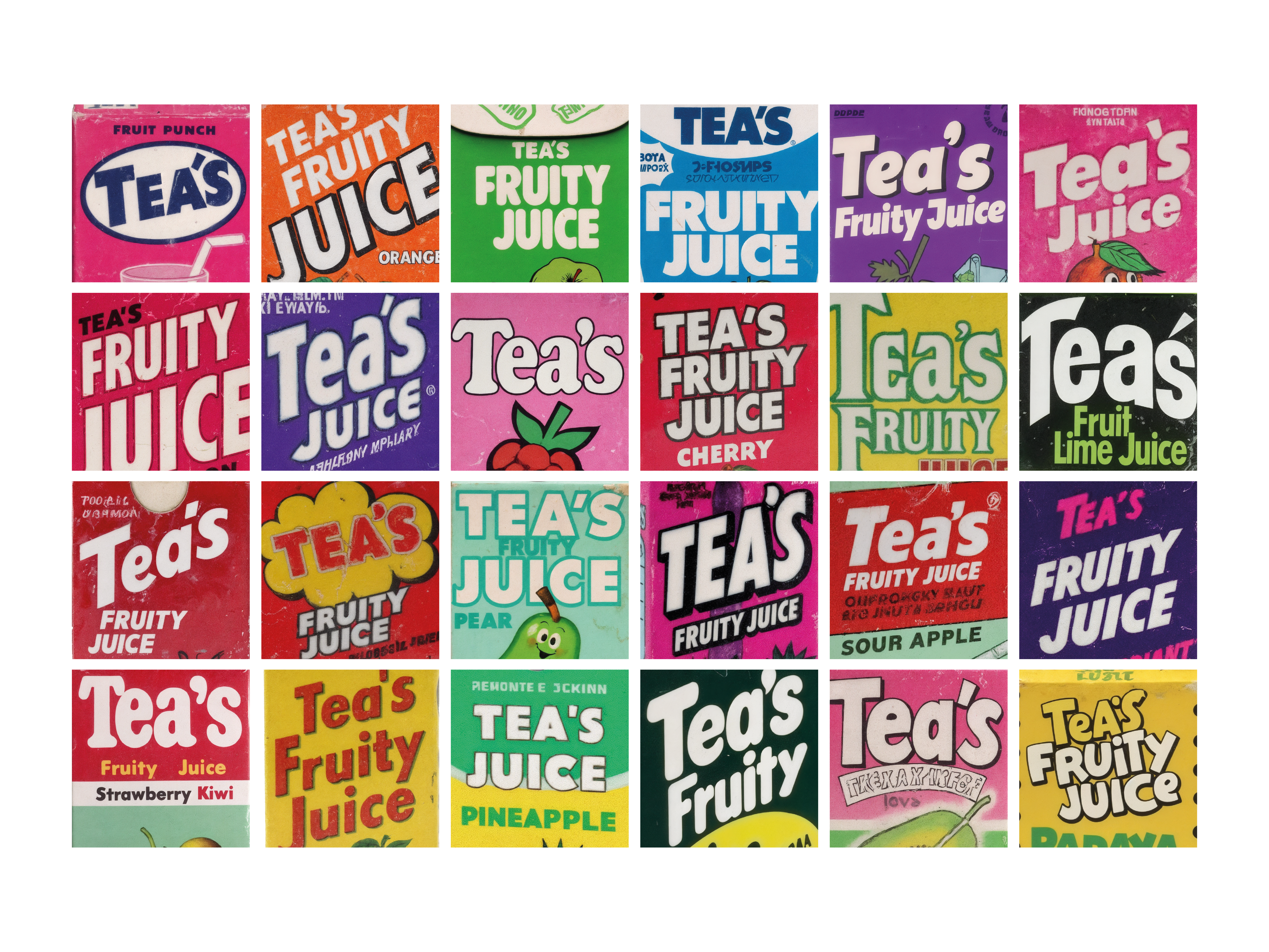
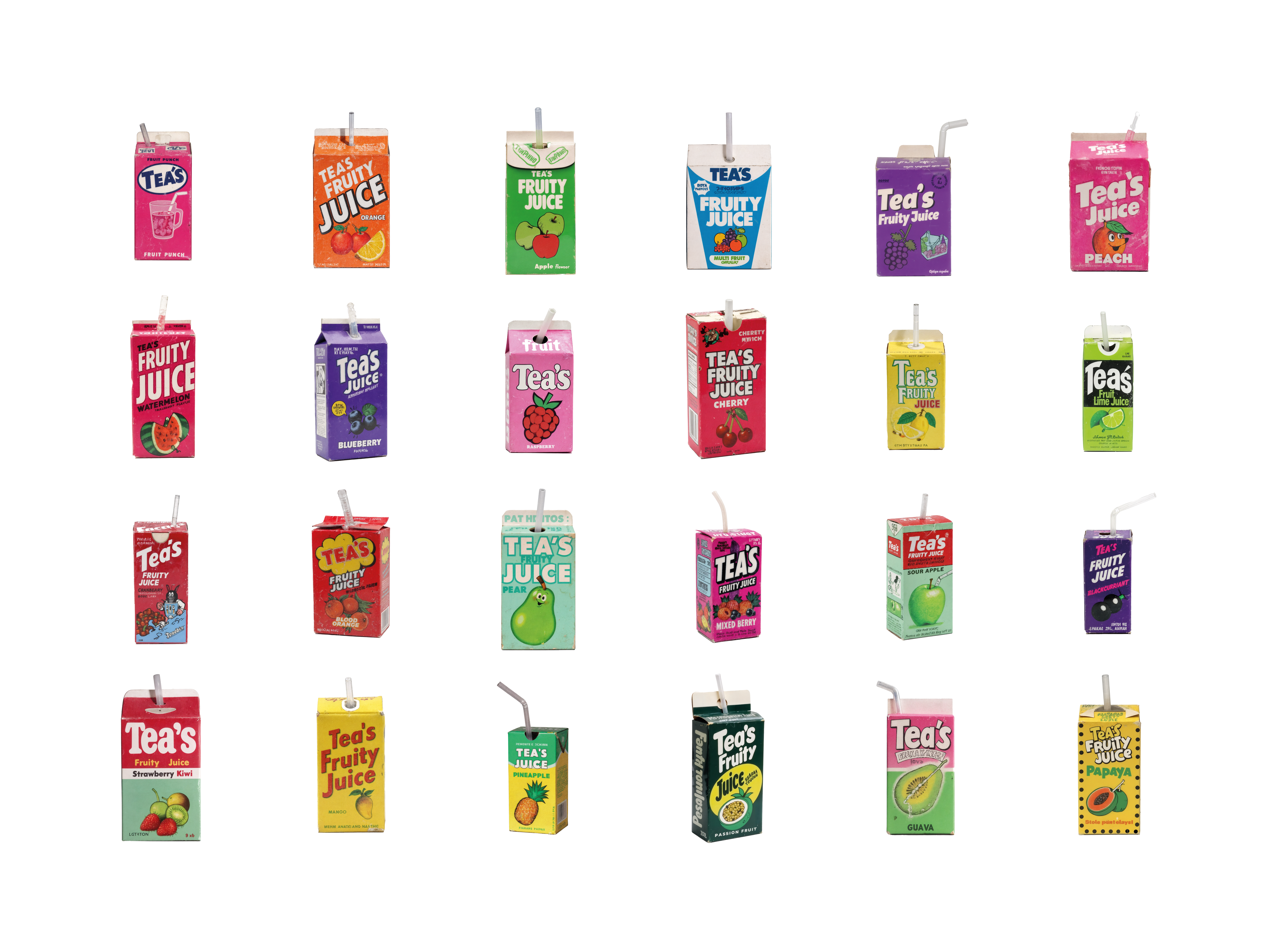
Tea’s Fruity Juice is a fictional beverage brand celebrating bold flavors and maximalist design through a shared visual language of fruit overload, retro pop energy, and tongue-in-cheek advertising. Each juice variety – from lime to cherry – has its own flavor persona, typographic tone, and color palette, yet all belong to the same hyper-collectible, supermarket-fantasy universe.
The project contrasts two layout principles: the chaotic, rhythm-driven Hyperlayout A4 pages, layering product shots, slogans, and oversized typography; and the clean, grid-based Inventory Pages, presenting each flavor as part of a structured, modular system.
All content was created using AI tools such as KREA and ChatGPT, not only for image generation but as co-creative partners in shaping a fictional, immersive brand world that feels both nostalgic and freshly exaggerated.
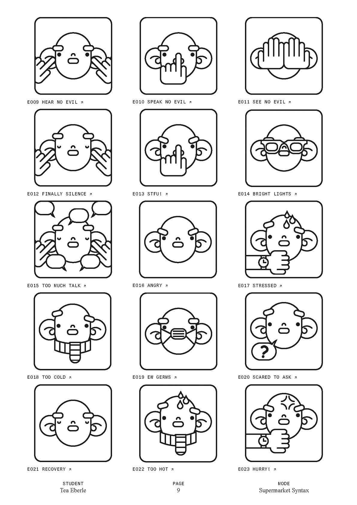
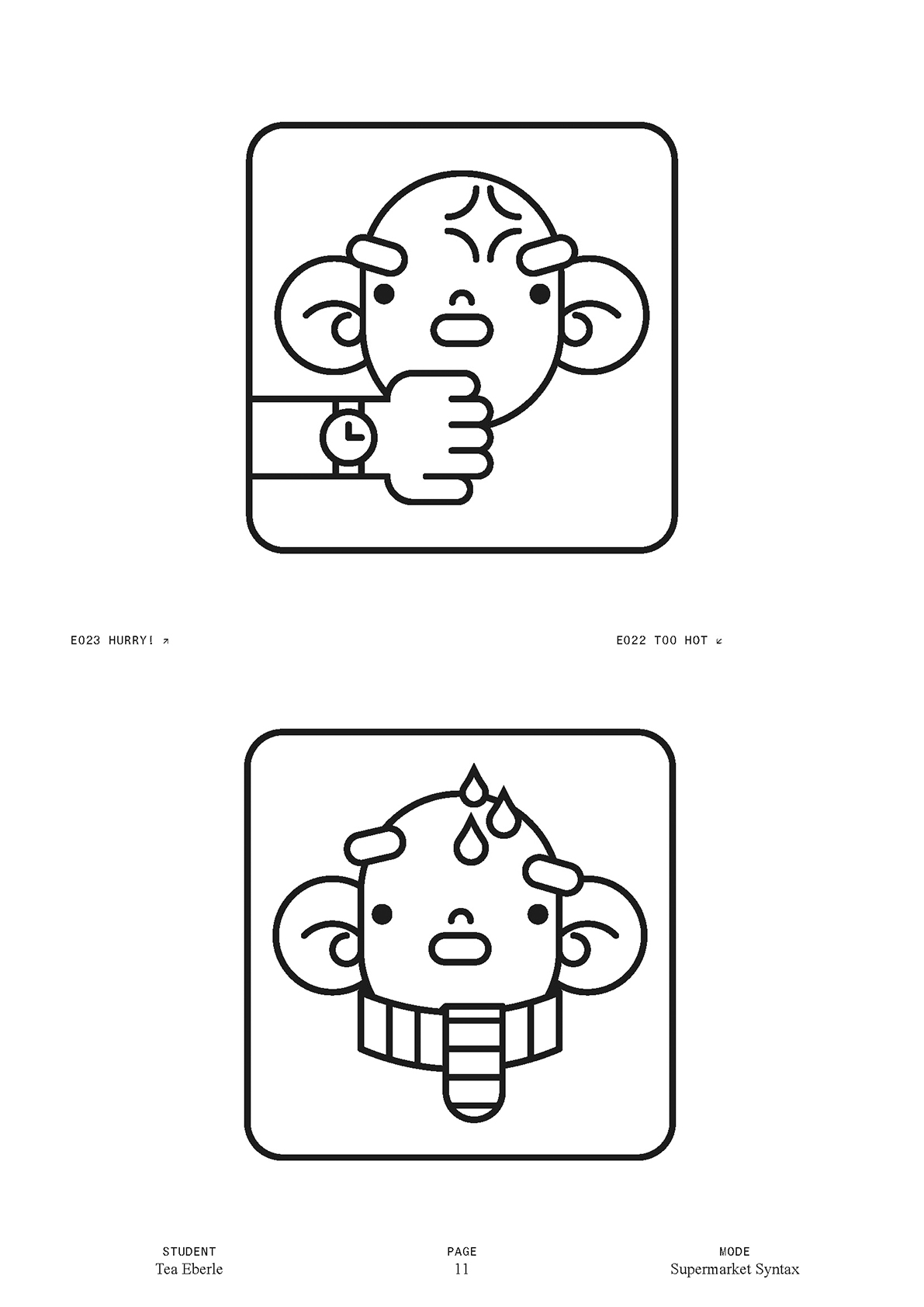
In Supermarket Syntax, I have visualised my own experience as a neurodivergent person in the supermarket. The icons show moments when I feel overwhelmed, irritated or misunderstood - be it due to bright lights, too many conversations, stress or uncertainty. With clear, reduced lines, I have designed states that are often difficult for me to put into words. The figures serve as a visual language for feelings that otherwise remain invisible. The project is a personal reflection on sensory processing, social codes and the desire for more visibility and understanding in everyday life. The pictograms serve as a tool to make the invisible visible and to decode reactions to everyday stimuli.
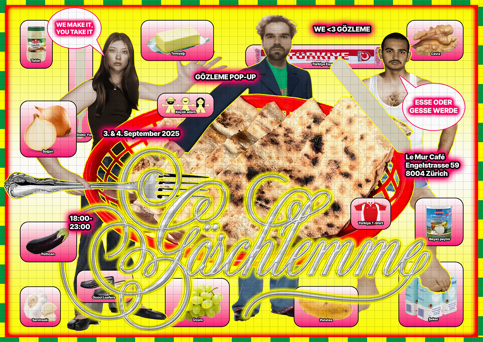
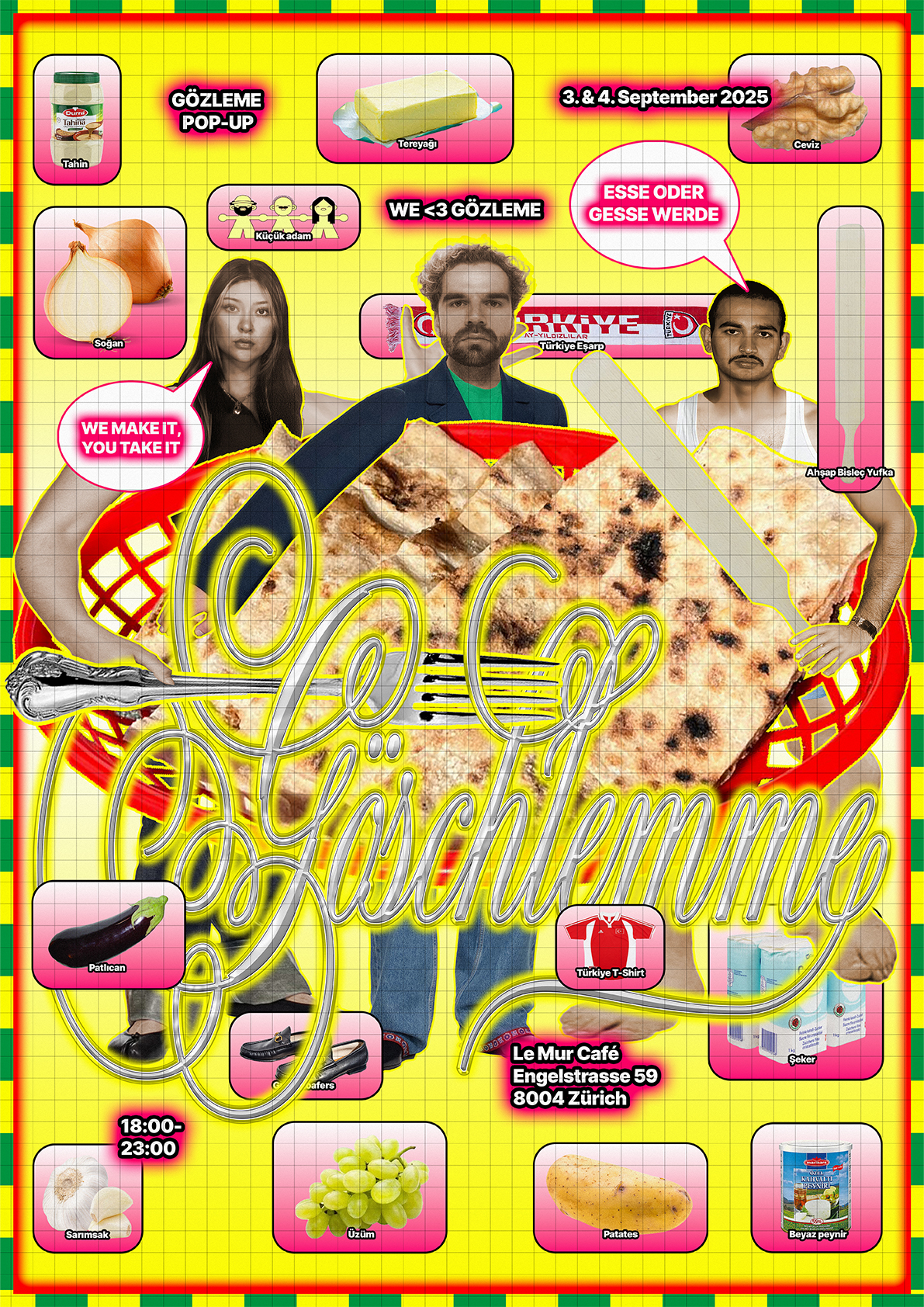
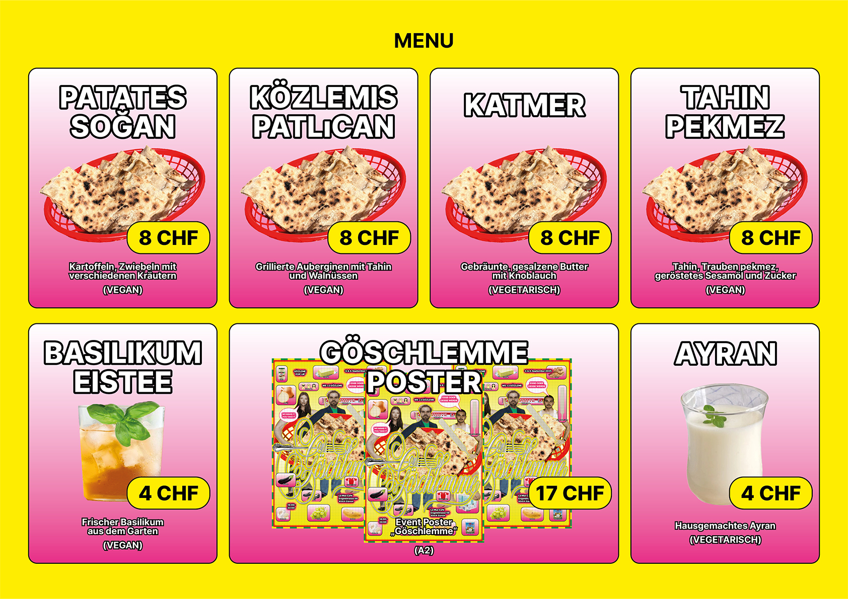
Göschlemme is a visual identity created for a gözleme pop-up run by friends of mine. The project includes a flyer, poster, and menu that embrace a playful, “trashy” aesthetic: bold colors, layered imagery, and a loud visual language. Despite the chaotic energy, the design follows a systematic grid, balancing humor and structure while celebrating street food culture in a striking, memorable way.
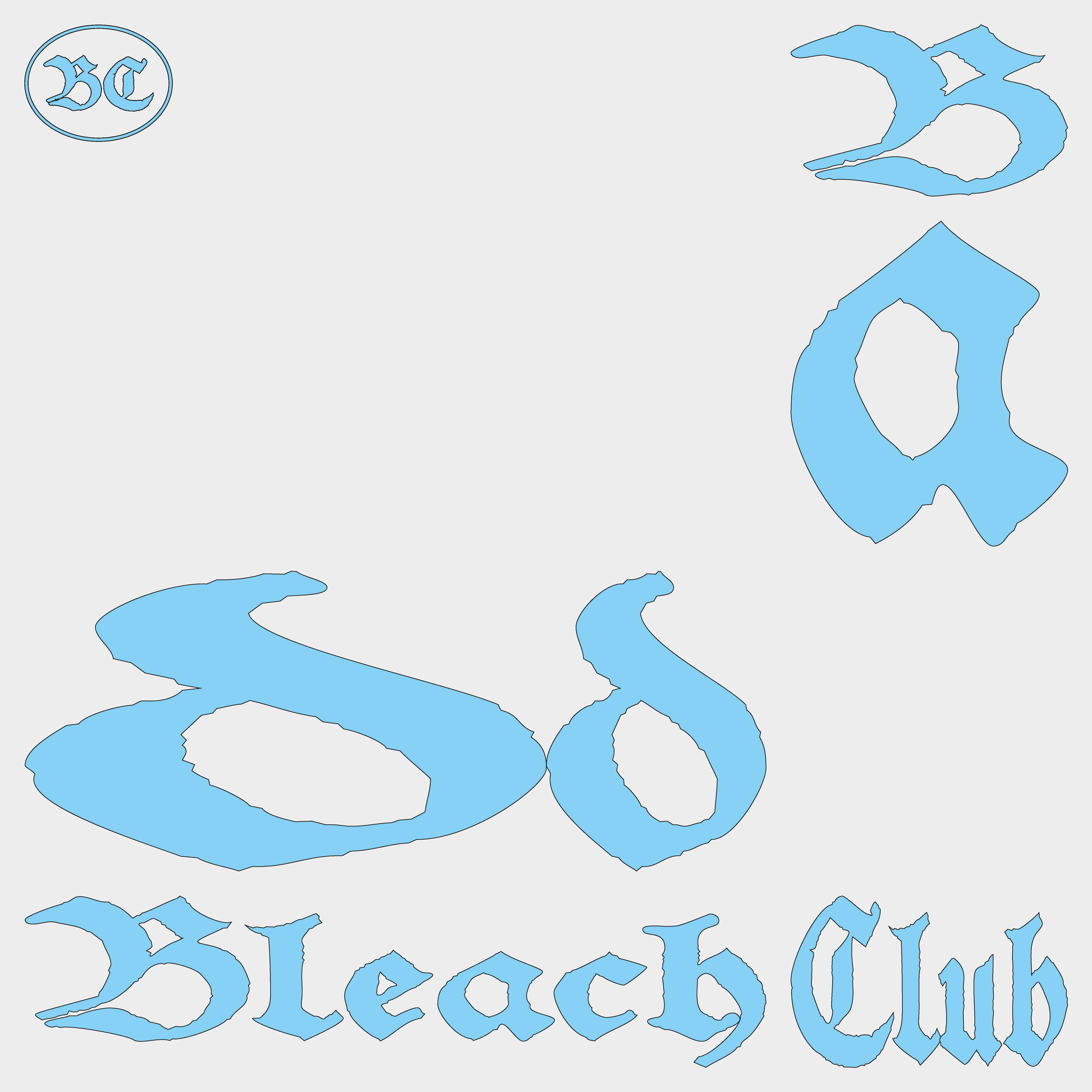
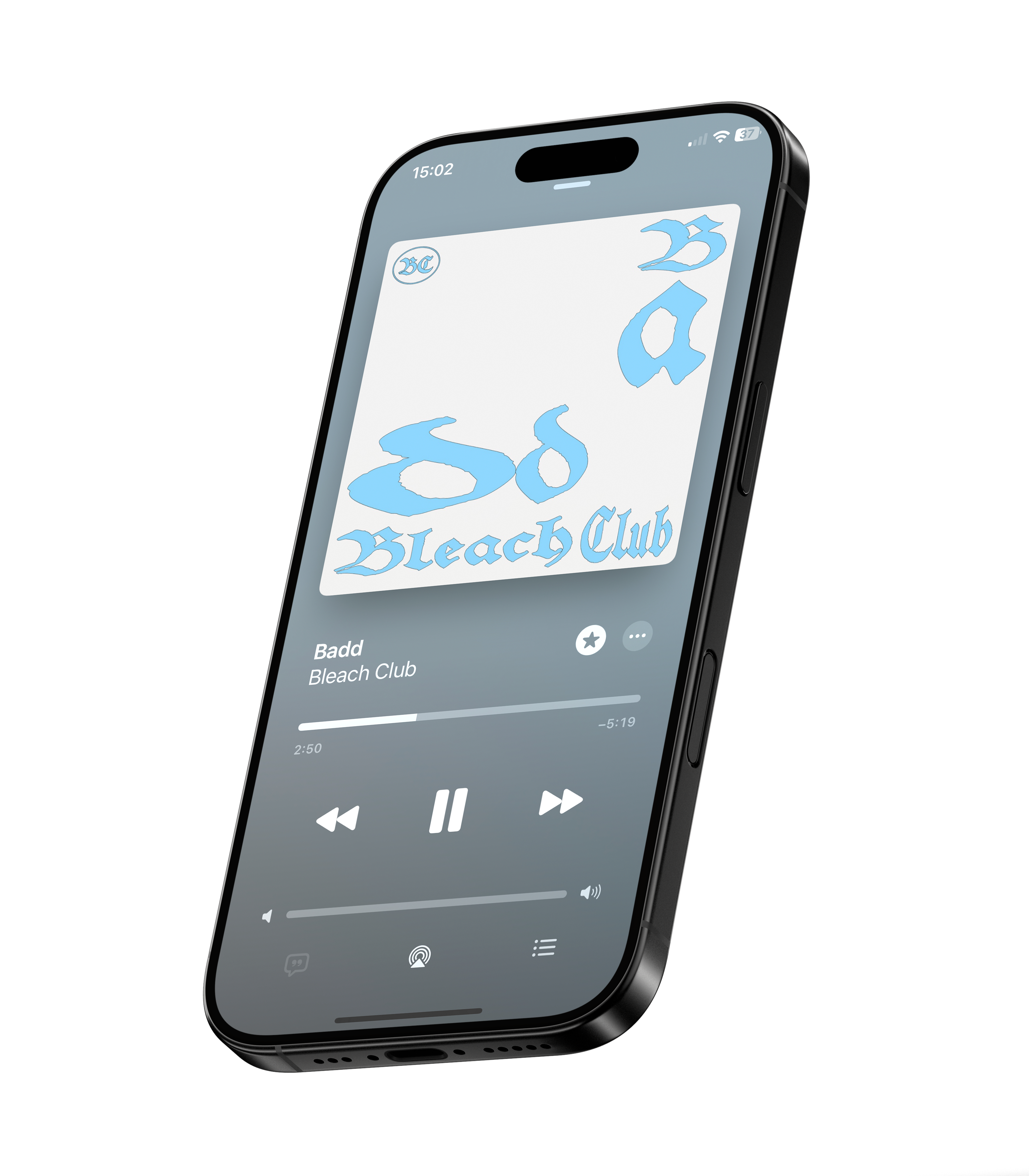
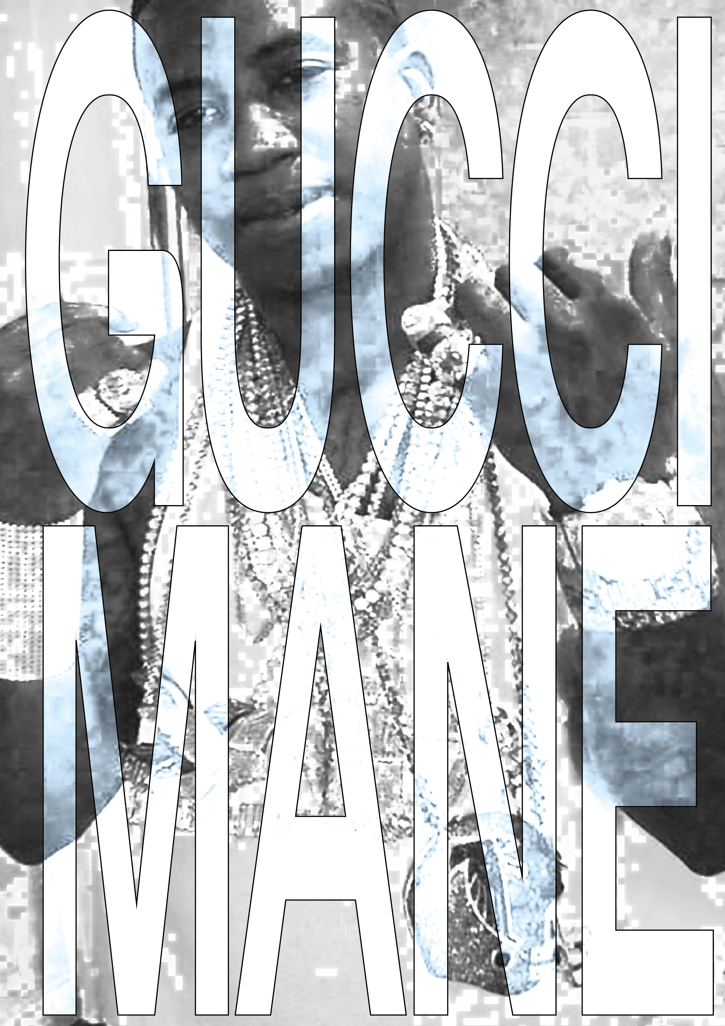
"Badd" is the first single from Bleach Club.
Bleach Club is a collective that I belong to, consisting of two other members. Our main focus is in the field of music, but we are also active in other creative areas such as design, video, and photography. I am responsible for the designing and creating our album and single covers and everything else our hearts desires.
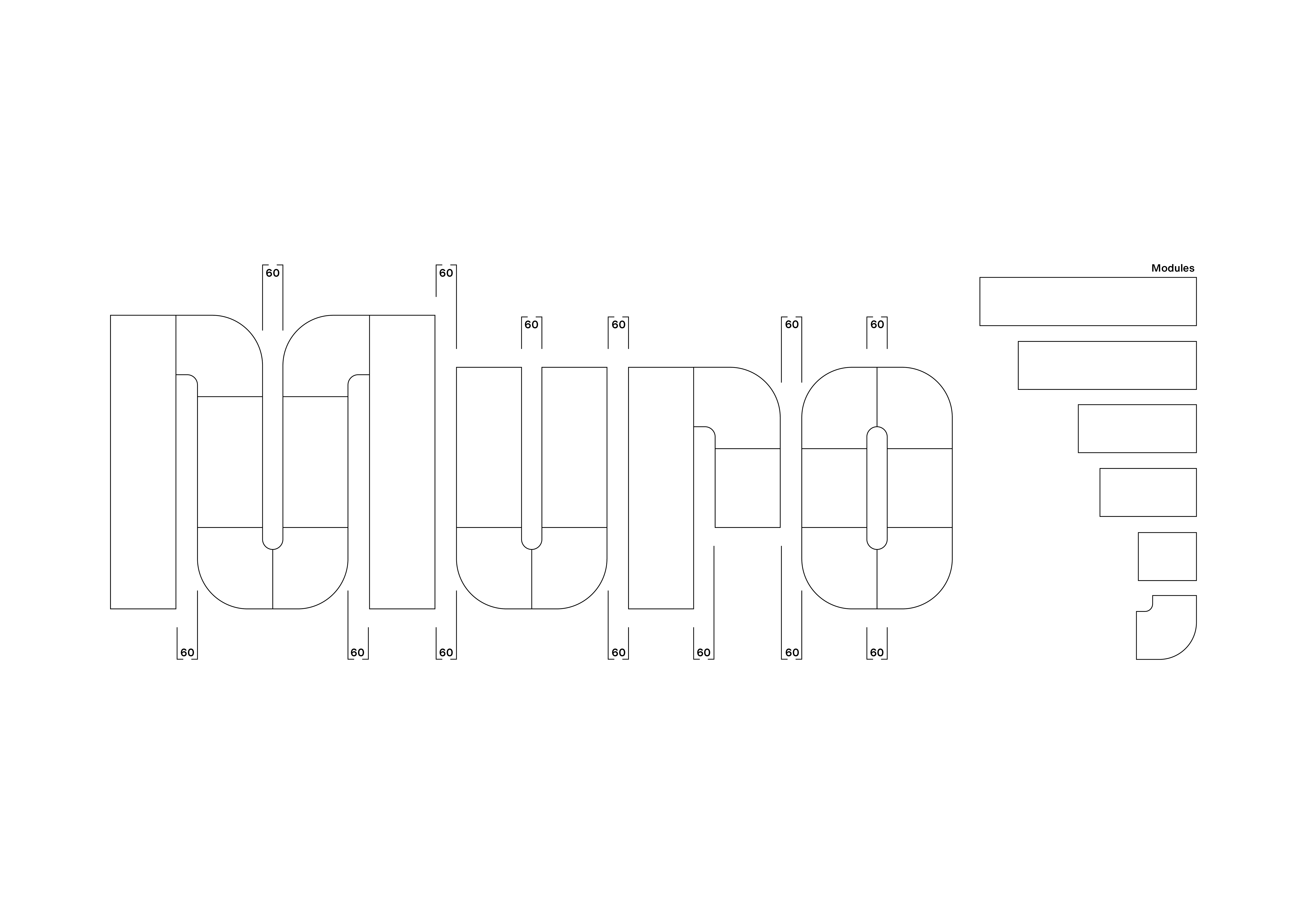
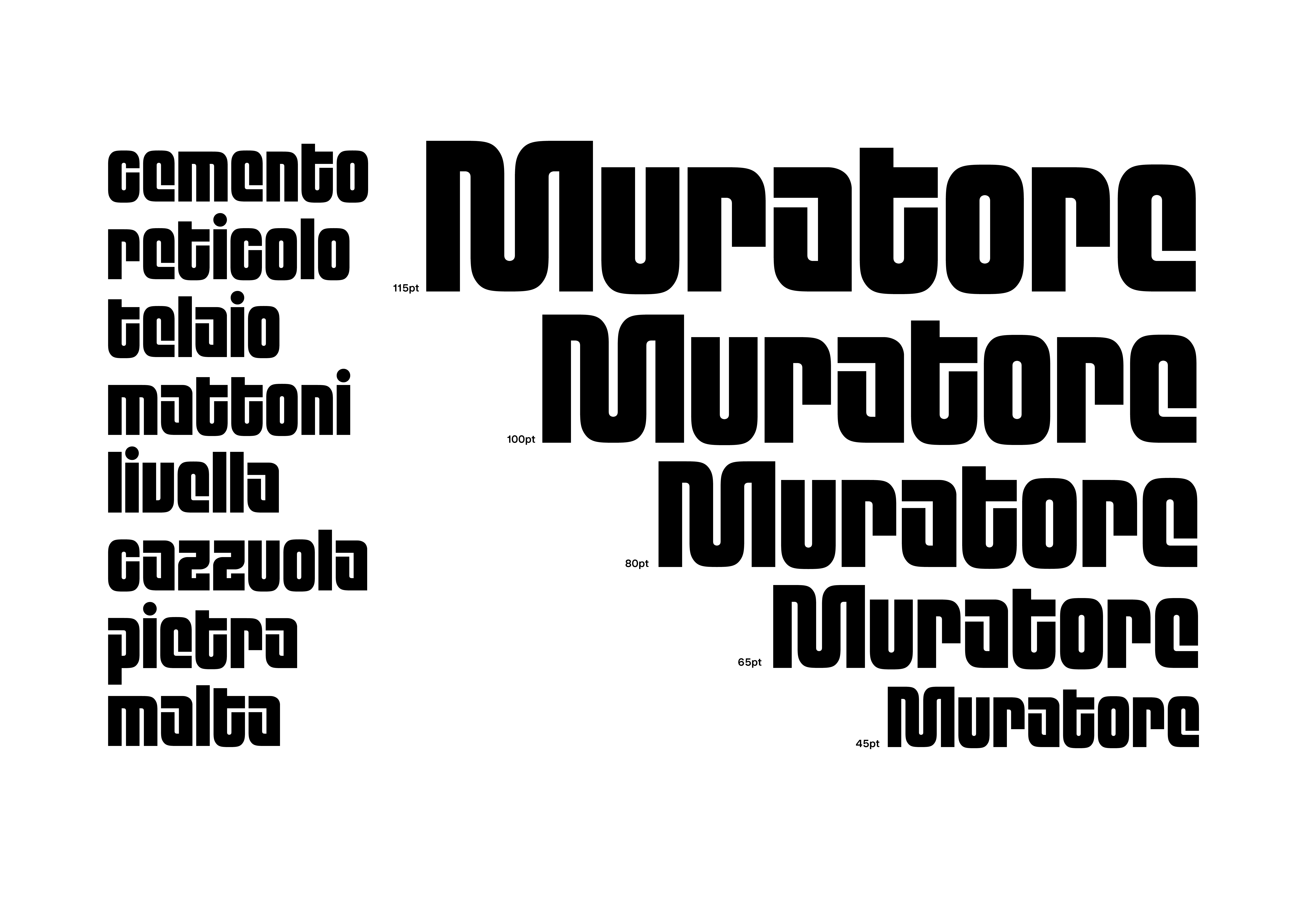
Muratore is a modular typeface developed in the first Type module at ZHdK. The name, meaning “bricklayer” in Italian, reflects its constructive nature: each character is built from a fixed set of geometric modules, resembling the systematic process of laying bricks. The font combines strict grid-based logic with bold, rounded forms, producing a heavy, architectural aesthetic. Its modular construction creates strong rhythm and cohesion across letters, while still allowing for playful variation. Muratore embodies the balance between structure and creativity, functioning both as a display typeface and as an exploration of modular design principles.
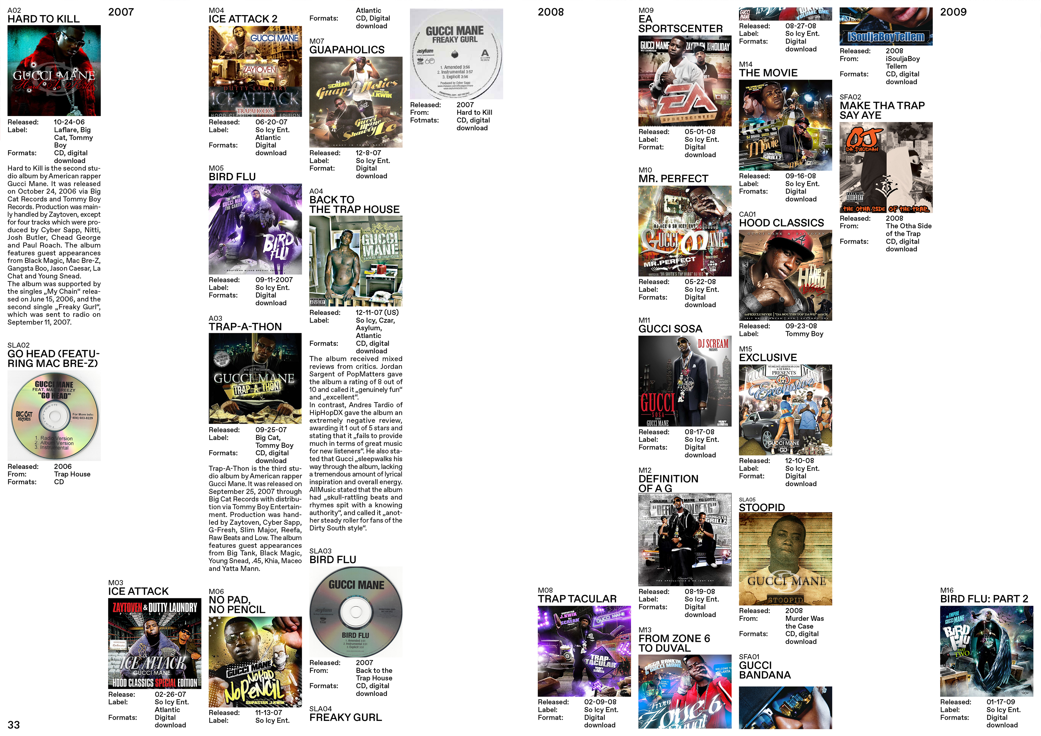
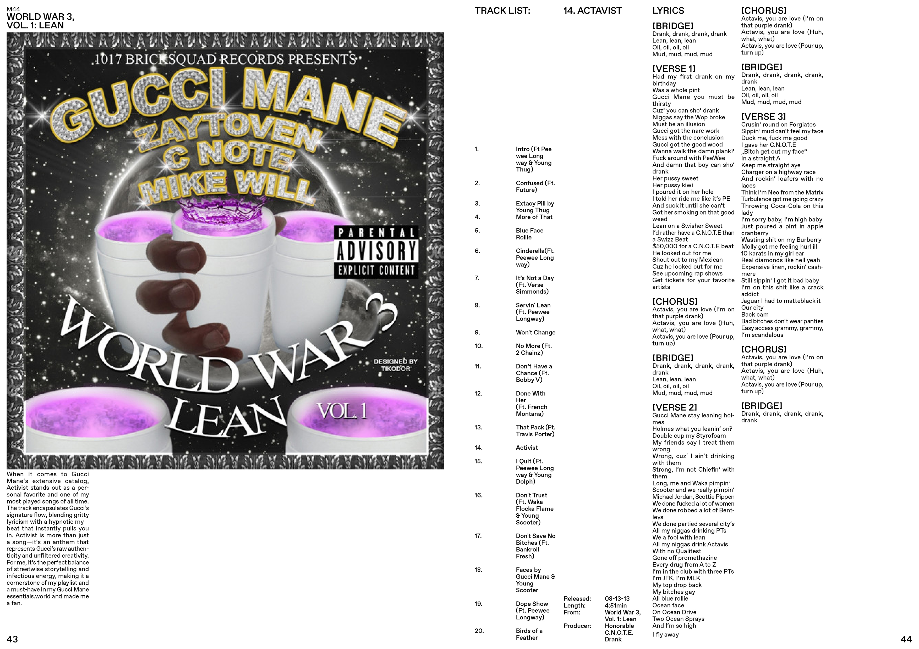
Gucci Mane Discography Book is an editorial project that transforms the rapper’s vast discography into a structured visual archive. By using the list as a guiding system, the book organizes mixtapes, albums, tracklists, and lyrics into a clear yet dynamic rhythm, celebrating the scale and influence of Gucci Mane’s output.
Hi, I’m Tea, 24, from Zurich. I’m currently studying Visual Communication at ZHdK, where I explore design and creative media.